Being the first visual a person takes in upon entering a building, the lobby is a paramount in creating a positive initial perception of a company. In an instant, the lobby establishes expectations the quality of service the guest is about to receive, while communicating the company’s personality and culture. Following are three elements to design and create experiential branding in a building lobby.
Feature Walls
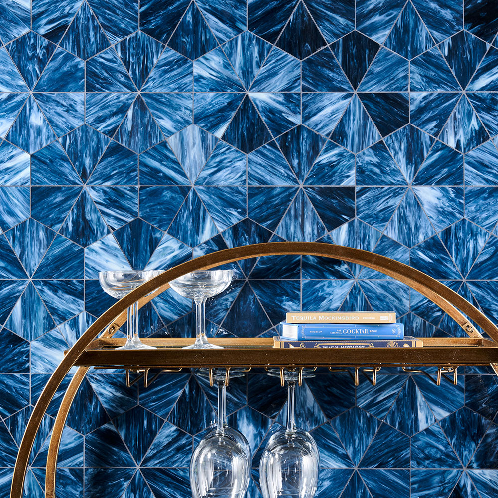
Using a feature wall in a lobby is a great opportunity to add a visual punch and instantly become the centerpiece to your space. Experiment with color, pattern, texture or dimension in an accent wall to reflect a brand’s personality and welcome a guest to the front desk.

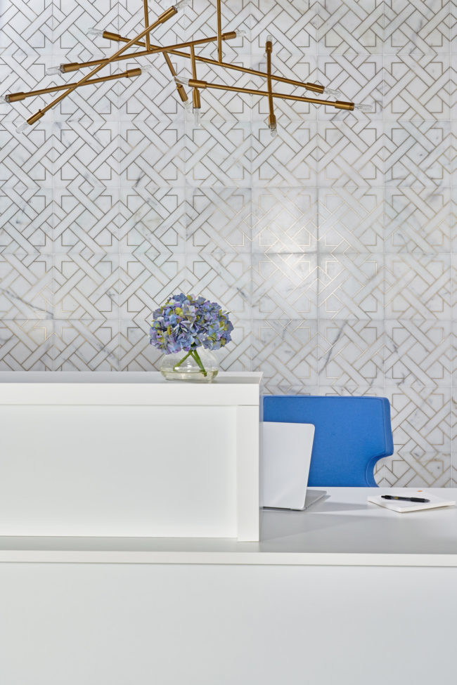
Wish Covet Calacatta with Brass
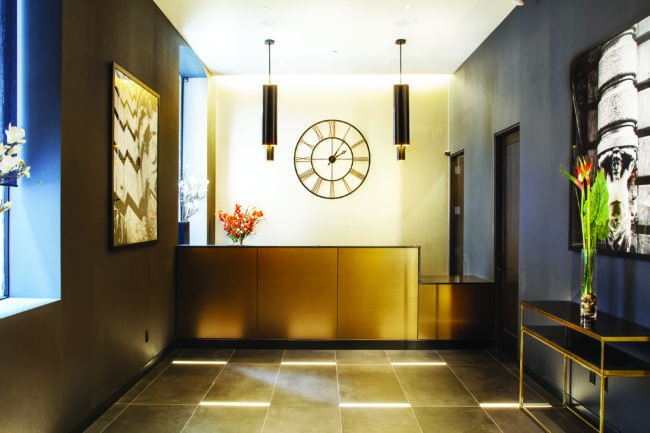
The metallic accents of Wish Covet Calacatta with Brass add an air of glam to this lobby, creating a stunning focal point that is sophisticated and sleek. Being a smaller space, a feature wall is a way to use luxurious material, such a natural stone with metal accents, in an economical way.

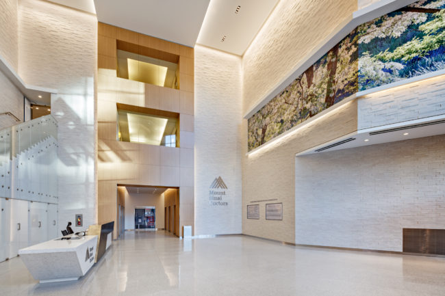
Mount Sinai Union Square designed by Studio A + T Architects. Photo by Ben Gancsos Photography
Accent walls can also be used to create visual impact by using dimension and texture. A 3-D Porcelain Mosaic covers the lobby walls in Mount Sinai Union Square, evoking a clean and minimalistic appearance that the healthcare industry desires.
Statement Ceilings
More often, designers are moving away from standard white ceilings and incorporating design details to give the space more ambiance. Darker colors make the space feel more intimate, while lighter or reflective materials create an airier feel. Texture also comes into play and can pull the aesthetic towards any goal ranging from rustic to elegant.

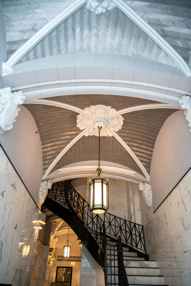
220 Fifth Avenue, NYC designed by James Pine. Photo by Marco Ricca.
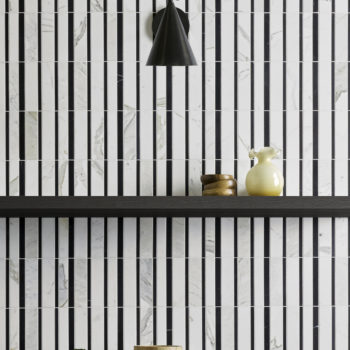
AKDO’s Textile Glass in Ikat Silver Silk on a vaulted ceiling brings the drama, shimmering in this this commercial lobby designed by James Pine. These micro batons of glass have a unique glow because of their diminutive shape, reflecting light and drawing the eye upward to admire the luxurious neo-gothic architecture of the building.
Flooring
When choosing the flooring to use in a lobby or atrium, it is important to consider the performance advantages of the material, that also fits into your overall design aesthetic, while speaking to the brand presentation.

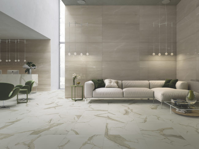
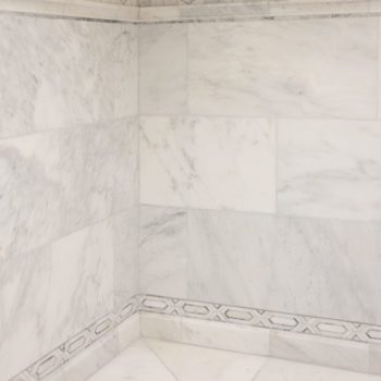
Renaissance 24″x24″ Calacatta Gold (M)
Porcelain tile is a preferred flooring material in lobbies or common spaces due to its high durability combined with high slip resistance, low-maintenance requirements and ease to clean. Beyond the functionality, large-format porcelain tiles can meet a wide range of design aesthetics. Create the elegant look of classic Italian marble using stone-look porcelain field tile with AKDO’s Renaissance collection.

Apple Core Hotel Project, New York NY, designed by Moment Design + Productions, LLC
Coupling a cement-look porcelain with accent lighting in the floor creates an industrial but inviting message connecting guests to this La Quinta lobby.
Ultimately, it is important to consider the practicality of your material, while providing a pleasing aesthetic when designing your space. No matter the design style, provide a visually striking introduction to any building with AKDO.

