Inspiration
- About Us
- Products
- How to buy
- Inspiration
- Resources
- Contact Us
Inspiration
 A change of season often signals a refresh – whether in interiors, fashion, or otherwise – and a new color palette is typically the best jumping-off point. Each Autumn, we see certain colors make their way back into the spotlight; from rich jewel-tones like sapphire and emerald, to berries and glistening metals. This year, Pantone’s Fashion Color Trend Report for Fall/Winter 2018 provided AKDO all the necessary inspiration for establishing an on-trend, yet timeless selection of products to ensure your interiors showcase the best in color, whether you choose a color-pop or a neutral hued surface.
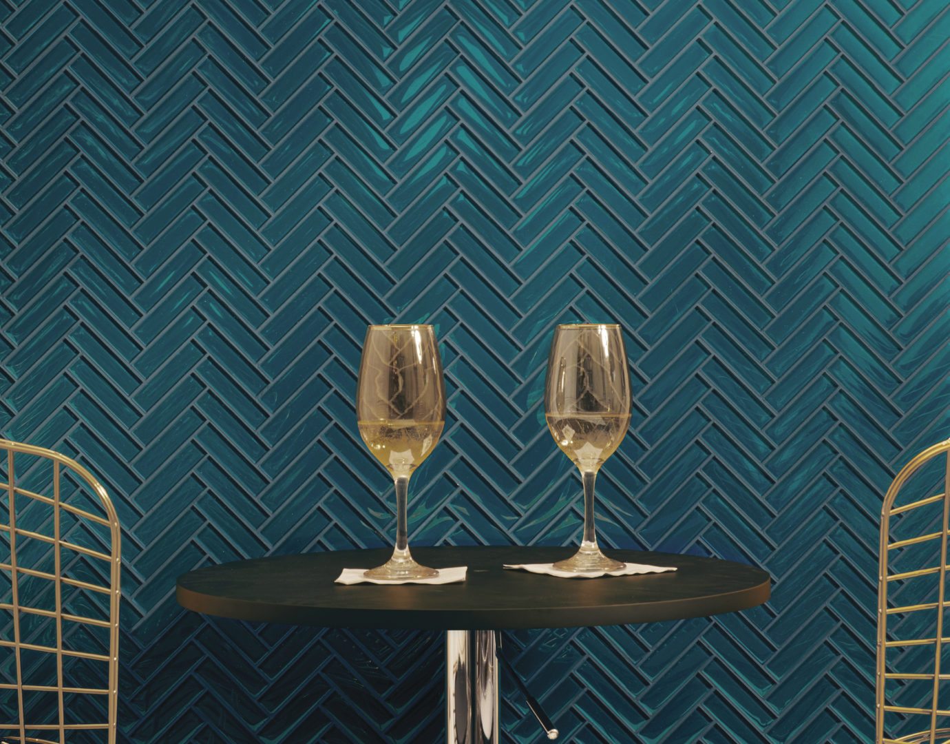
 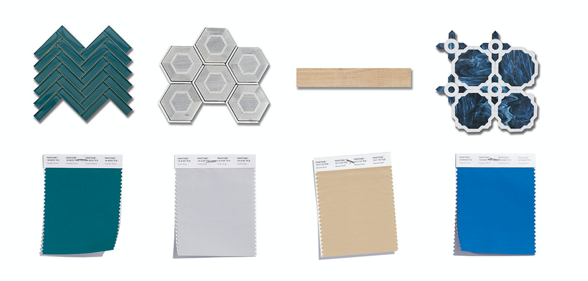 1) Pantone 18-5025 Queztal Green: A deep elegant blue-green hue suggestive of rich plumage / Matches AKDO’s Lagoon
2) Pantone 14-4107 Quiet Gray: Unobtrusive and timeless soft gray / Matches AKDO’s Ash Gray
3) Pantone 14-1116 Almond Buff: Natural baby camel hue with understated appeal / Matches AKDO’s Faber Straw
4) Pantone 18-4048 Nebulas Blue: Reminiscent of twilight, a thoughtful, starry-eyed blue / Matches to AKDO’s Whimsy Sapphire 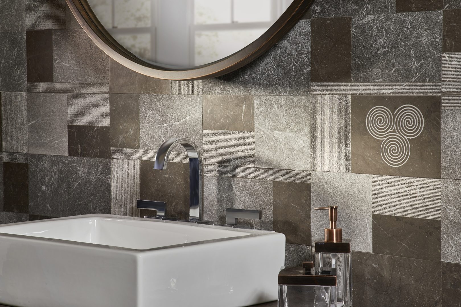
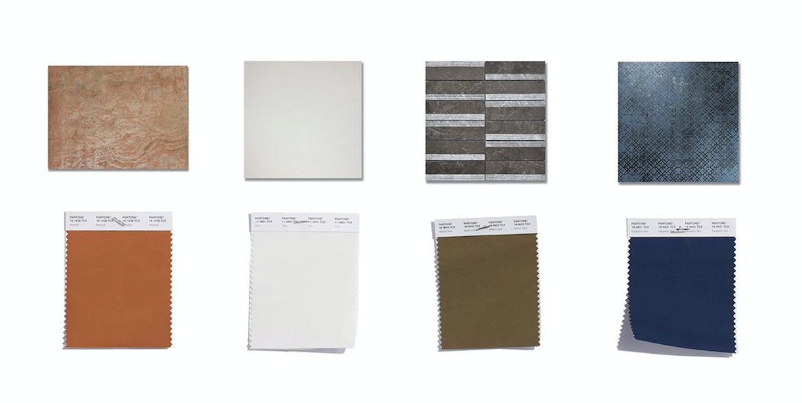 5) Pantone 16-1438 Meerkat: A highly adaptable toasty burnished brown / Matches AKDO’s Motion Copper
6) Pantone 11-4801 Tofu: Creamy white staple / Matches AKDO’s Ephesus Dune
7) Pantone 18-0625 Martini Olive: Smooth, sophisticated and urbane green adds depth / Matches to AKDO’s Kaya Azan Brown
8) Pantone 19-4031 Sargasso Sea: Boundless and fathomless blue mooring the palette / Matches to AKDO’s Etro Metal Blue
This group of rich blues, greens, browns and neutrals make playing with color simple. Which hue is your favorite?
Explore the latest and greatest from AKDO.

")
Dealer Login | Privacy Policy | © 2024 AKDO, Inc.